I love the old saying, “Don’t judge a book by its cover”. In a fiction setting, it’s easy to create instant impressions in terms of the storytelling world before you. If you were about to read a story featuring a character called Prudence, you might conjure up images of a lady of a certain age enjoying her retirement and a sedate lifestyle, mingling with like-minded individuals. Though the Prudence I most vividly remember appeared in the pages of the “Friend” as an elegant British spy, brought out of retirement to serve her country.
Pru the spy works as a visual treat as she forms a striking image in the reader’s imagination. A strong story title can grip a reader’s imagination, too. Last year “The Farthing In The Beam” appeared in the magazine as a serial. I love that title; it’s as if the title is making a bold statement, creating intrigue, and in order for the readers to find out the full context, they need to read on.
Art Impressions
It’s the same with our story illustrations. A lot of thought goes into the artwork, from reading a story to coming up with a brief which will do the characters and scene(s) justice.
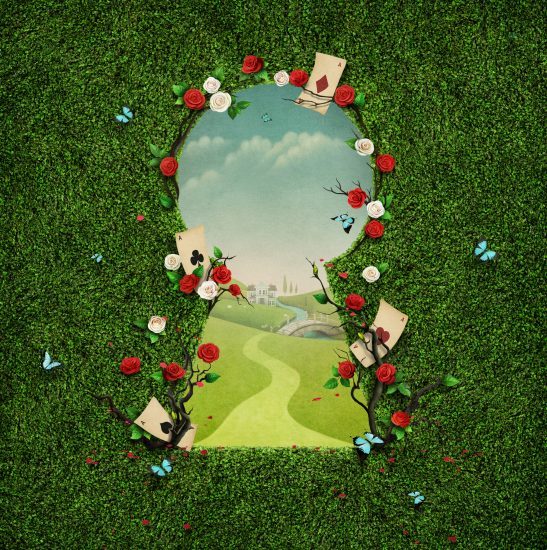
Our commissioning illustrations editor, Sarah, is a talented illustrator, and she does a super job coordinating the magazine artwork. What I like most is an illustration which, on the face of it, looks too magical to represent a story. However, it’s all about creating a memorable impression, and these types of story illustrations are all about the conveyed imagery, where story meaning is subtle and often reflective.
So, whether a character’s name or story title intrigues you, or not, as the case may be, or an illustration looks just that little bit different, I’d suggest reading on and seeing what the writer and illustrator have in store for you. If you are like me, you’ll often be pleasantly surprised as to how a story world can so perfectly knit together.


