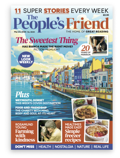
Cover words. They’re tougher to nail than you might think.
“Adventure?” Nope, too long.
“Polly Pullar’s pictures . . .” No, a bit heavy on the alliteration.
“Fun on the farm?” Yup, that’ll fit.
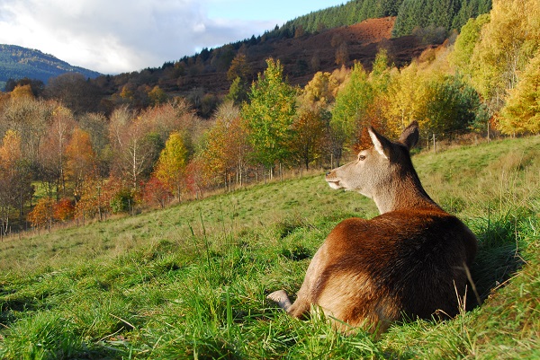
Photograph by Polly Pullar.
You should never judge a book by it’s cover, they say, but with magazines . . . well, that’s a different story.
It’s where we tell you a bit about all the lovely things inside each issue, but the wonderful features and fiction we pack into every issue are hard to sum up in just a few key words!
Plus it’s all too easy to knock the alignment out with a word that’s too long — or even too short!
We’ve got a fab feature coming up about the 140th year of the Blackpool Illuminations . . . a title which was right on the edge of being too big.
Imagine if we did a feature about Llanfairpwllgwyngyllgogerychwyrndrobwllllantysiliogogogoch in Wales!
If that ever happens, don’t be surprised to see “Gorgeous North-west Wales” on the cover instead . . .
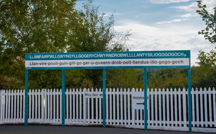
iStock.
At the moment we’re working on a late October issue with some great stuff inside (not least Polly Pullar’s “Autumn On The Farm” article).
We try to make sure the cover words capture the mix of content inside — the knitting or craft; the cookery; the fiction.
Depending on the layout of the view in our cover painting, we sometimes have to be quite flexible to fit words in around the scene.
But it’s important.
We love that our subscribers and regular readers might not even pay that much attention to what’s on the cover before diving right in, but we want to let everybody know!
If you’ve ever wondered how the cover painting comes to life, find out all about it here.
Click here to read more of Alex’s Features Ed Blog.
