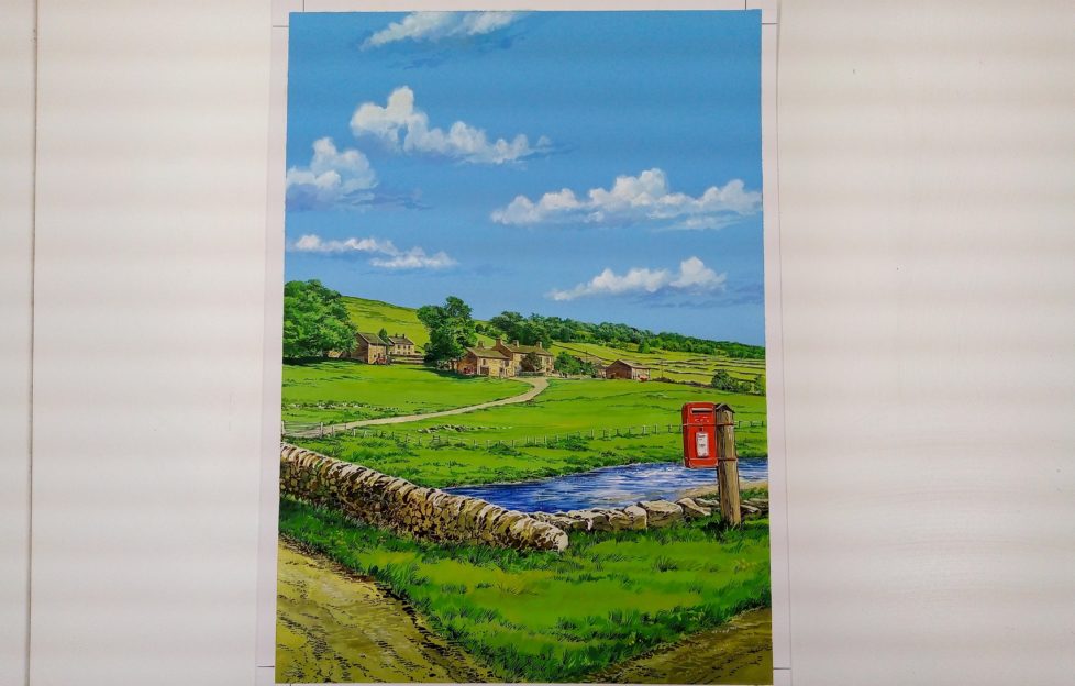
Have you ever wondered how we go about choosing a front cover?
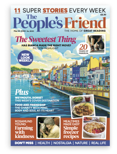
Our cover is one of our most identifiable features. Watercolour landscapes from around the British isles are our signature style, and have long been very popular with our readers.
But how do we pick them? And how do they go from new idea to newsagent?
The Writers
Choosing what we’ll feature is a joint effort between myself and our team of travel writers — Willie, Neil, Pat, Morag, Simon, Polly and Gillian. If there’s any destination that’s come up on our radar in the Features team, we’ll throw it out to the writer closest to the area and see if they can arrange a visit.
Just as often, the writers will suggest places they think are worth a visit. We then see if they’re the sorts of places that can make a good “Friend” cover feature.
This all depends the photo that will be used as a reference for the painter, or the “cover shot”. Can we find somewhere in or very close to the place mentioned, that’ll be sure to stand out on the front of the magazine?
It needs to have space at the top and bottom for our logo (the masthead) and the boxes telling you about the content, and it needs to be striking. And hopefully identifiable!
We’re also keeping an eye on that mix of Scottish (50%) to English, Irish and Welsh (50%) locations. Plus we want to make sure we mix up watery ones with hilly ones and urban ones, etc. etc.
The Ref
Once we’ve choose a picture — either from the writer’s selection or from one of the photo agencies —this will be the reference for the painting.
Sarah – our Illustrations Ed – prints them out as part of a cover mock-up (as below, with roughly the sort of shape of words that will be on the finished product), then I give them to Editor Angela to take a look at.
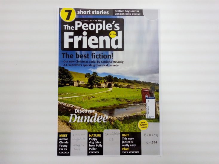
Angela will mark her favourite from the selection, and we’ll give it an issue date. We pay the writer, and Sarah chooses an artist to send the pic to.
The below Yorkshire cover, from an issue earlier this year, was sent out to Graham Bleathman. Graham’s great at anything with a touch of architecture about it. His eye for detail is outstanding — as you can see in the work he’s done for the Thunderbirds brand.
The Painting
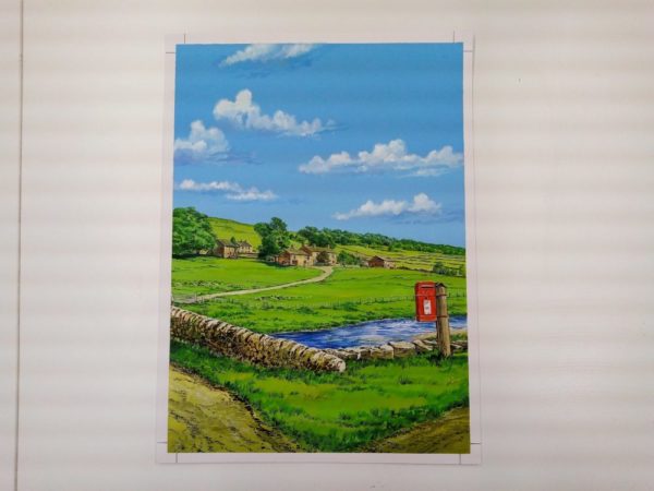
The finished piece then comes back from the artist in a size much larger than the final cover, to allow for detail when shrunk for the page.
Sarah then scans it, and it’s over to the Design team to mock up a cover, and work with Angela on the words and order of things on it.
The Finished Product

And there it is!
This makes choosing a front cover sound easy, but we really do work hard to make sure it’s just right.
If there’s anything else you’d like to know about how we put the magazine together, get in touch! You can reach us on Facebook, and Twitter, by email or by post!
