I’ve talked about and written bits and pieces already about our magnificent 150th Fiction Special, which is on sale now.
I’ve talked mostly about how we chose the stories, why we made the selection we did, and so on.
We chose each story in the hope that — as well as representing a moment in time, a mood, a shared experience — it would touch the reader’s heart. That was the Fiction team’s own benchmark as we scoured the Archives for just the right stories to reprint.
That part of the process was all about the reading experience.
A good look
But this special edition had to look good, too — and that wouldn’t have been possible with the original story illustrations.
In fact, many of the stories didn’t have illustrations of any sort in the early years. They were just columns of type. A limitation of the era’s printing technology.
Modern-day readers, however, have different expectations. We wanted to meld the two.
For stories that had no illustration, we found others in those original volumes that would suit.
Other, later stories did sometimes appear with illustrations, but they were simple pen and ink drawings in black and white.
Again, not what today’s reader expects, and they would have made this edition look very dull.
And that’s where our super talented Illustrations Editor Sarah Holliday came in.
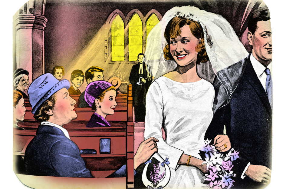
She was able to take each line drawing, and using a programme on her computer, colour it up.
But, more than that, she chose tints and colours sympathetic to the era in which the story was set.
If she were to get it wrong, the image would be quite jarring. As it is, every single one is a perfect match for its era and its story.
At the top of the page is one Sarah coloured. Below it is in its original form.
Quite a difference, isn’t it?
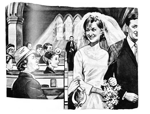
Illustration by DC Thomson Ltd.
For more on our 150th Fiction Special, click the tag below.
To order your copy, visit the DC Thomson Shop.
