 Shutterstock / Maksym Fesenko©
This is the second year in a row I have been lucky enough to illustrate St George for our colleagues at “This England” magazine.
It is always a great scene to illustrate; every part of the composition needs to be balanced and dynamic at the same time. Between St George, his horse and the dragon, there is a multitude of positions available.
The challenge is to make sure that the card is completely different from previous years, while painting a similar scene.
2020’s illustration was:
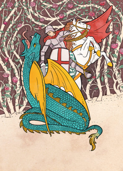
Illustration by Manon Gandiolle.
The editor at “This England” suggested an even more dynamic scene this year, with the dragon tangled around the horse’s legs. She wanted to keep a traditional style of illustration, while steering away from last year’s look — possibly making it a little simpler.
First thing’s first: I started looking at references for the illustration.
Any drawing needs a good reference if we aim for it to be a little realistic. References also help me expand my horizons when it comes to poses and angles.
I use photos, illustrations or even sculptures as references. Sometimes we can find great illustrations on image banks such as Shutterstock or iStock, but the style isn’t suitable for the illustration we need, or some details are not quite right. This is why it’s important to be able to mix and match.
My first roughs usually look like this:
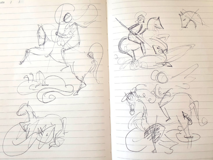
Photograph by Manon Gandiolle.
Then I narrow down my options, and add details.
I drew two roughs with pretty similar ideas, but slightly different poses and sent them off for the editor’s opinion.
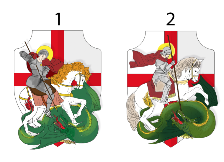
Illustrations by Manon Gandiolle.
While option 1 was her favourite, she preferred the mane from horse number two. Which is exactly why sending a couple of options can be handy at times!
The final step
Now comes the final step. Unfortunately this step is never straightforward!
It is about cleaning out my illustration. Adding details; changing colours; adding shadows; changing more colours; adding texture; making sure the contrast of the overall illustration is correct; adding more details again to the horse’s mane; changing more colours because I have decided that the yellow colour I first picked was too bright; fixing the armour’s look; wondering if the shadow behind St George and his horse is necessary, removing it, adding it again because, yes, it was necessary.
It is a lot of trial and error, and it is sometimes hard to decide to stop and call the illustration “finished”.
Sometimes, I find it better to save my illustration and not look at it for a full day, and then come back to it with fresh eyes.
It helps me differentiate between a necessary change, and just being picky!
This brought us to the final illustration:
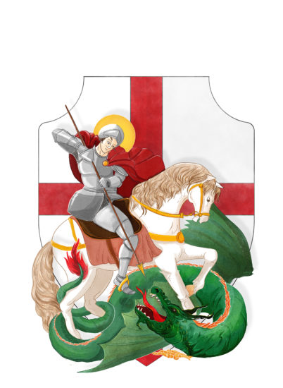
Illustration by Manon Gandiolle.
And the card is now on sale on This England’s website!
For more from the “Friend” team, click here to read our blog.
