Today is St Andrew’s Day, a national holiday here in Scotland.
It seems the perfect time to take a look back at the time “The People’s Friend” specially commissioned our very own tartan!
Here, Angela explains how we decided to celebrate our 150th anniversary in a very colourful way . . .
This is a story that begins back in 2008. That’s when we met Brian Wilton of the Scottish Tartans Authority to discuss creating a special tartan design for the magazine.
Unfortunately, the project didn’t go ahead at that time – but you can’t keep a good idea down!
Several years later, on a wet February morning, Design Editor Jaclyn and I headed to the pretty Perthshire town of Crieff. This is where the Scottish Tartans Authority had its headquarters.
There, fortified by tea and chocolate biscuits, we discussed every characteristic of the “Friend” in detail, as Brian searched for inspiration for his design.
The experts define tartan as:
“A design which is capable of being woven, consisting of two or more alternating coloured stripes which combine vertically and horizontally to form a repeated chequered pattern.”
Enjoy owning a special part of “Friend” history
The art of modern tartan design is fascinating. Every component, colour and line tells part of the story. Luckily for us, we had 150 years of history to draw upon. So there was no shortage of material!
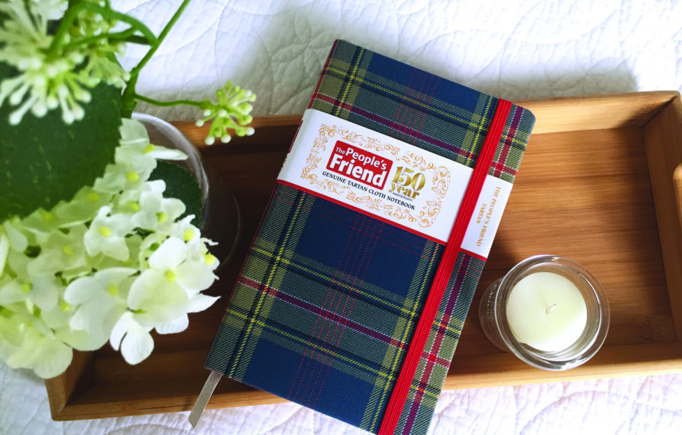
Brian worked wonders with all the information we gave him. And he came up with a beautiful red- and blue toned tartan that symbolically tells the story of 150 years of the “Friend”.
The tartan now covers a gorgeous hardbacked notebook. Made exclusively for us by Waverley Books, it’s available to buy only from the D.C. Thomson Shop.
I hope you enjoy owning and using a very special part of “Friend” history!
Our tartan story
This tartan was inspired by the history, values and traditions of “The People’s Friend”.
The bright azure blue reflects the sunny blue skies of J. Campbell Kerr’s distinctive watercolour cover paintings. The bold red stripe outlined by white represents the magazine’s instantly recognisable masthead.
The grey is a tribute to the city of Dundee, home of the “Friend” on the silvery Tay.
The five pink lines celebrate the five continents where readers enjoy the “Friend” every week. The 16 small squares they form fondly recall the number of pages in the magazine’s very first issue.
The single black line represents the type in each and every issue.
Yellow is the colour of friendship. It’s a quality the magazine’s readers value dearly.
This design is based on the Royal Stewart, a tartan originally created for the Royal House of Stewart.
Its choice symbolises the affection and respect readers of “The People’s Friend” have always held for the Royal Family.
For more on St Andrew’s Day, click here.
For more from the “Friend” team, click here.
