 Shutterstock / breakermaximus©
We love our story illustrations on the “Friend”. Not only do they have to complement the story, but they have to draw the reader into the story.
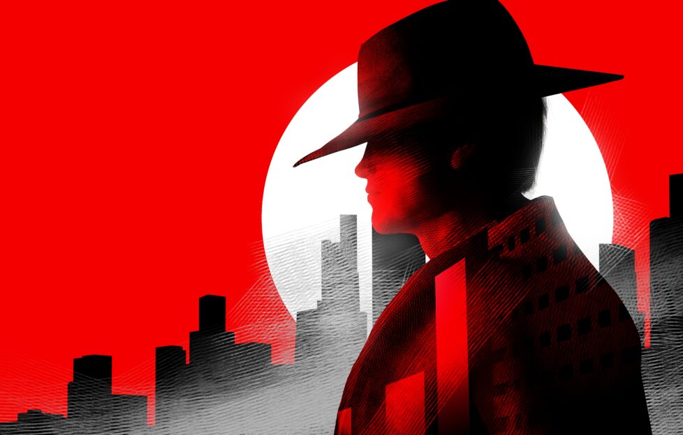
My favourite type of illustration is the montage, which pieces together separate (story) sections to form an overall composition. I like compiling montage briefs for stories and serials that encapsulate different characters and moods.
When I was at college, studying for my HND in Communication Studies, one of the modules involved interpreting movie posters. I found it an enjoyable, creative exercise. Students would analyse elements of a poster, highlighting its promotional value.
Things to look out for were colours, characters’ emotions and accompanying text – from the title to type of fonts used.
Look at some famous movie posters online – do they sum up the movie for you? Book covers can serve the same purpose, but in a more subtle sense.
The bigger picture
If you have written a story, whether it’s published or not, see if you can come up with your own movie-style poster that encapsulates what the story is about. It might help you see your story in a different light, and possibly improve aspects of story edits.
You don’t have to physically draw the scene/s out, but to simply visualise different story elements, and how they interlink with one another.
It could also prove a useful exercise at the story concept stage, where the imagination is often full of ideas. You can then decide what to focus on during the actual writing.
If your character/plot is lacking purpose, it might show in your mind’s eye. What colours do you see on your story poster – what wording would you use? Does this help reinforce the story meaning, in order to capture the reader’s attention?
Above all, have fun with your story poster ideas.

