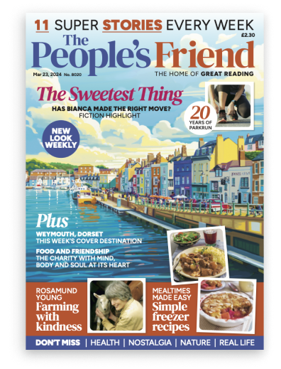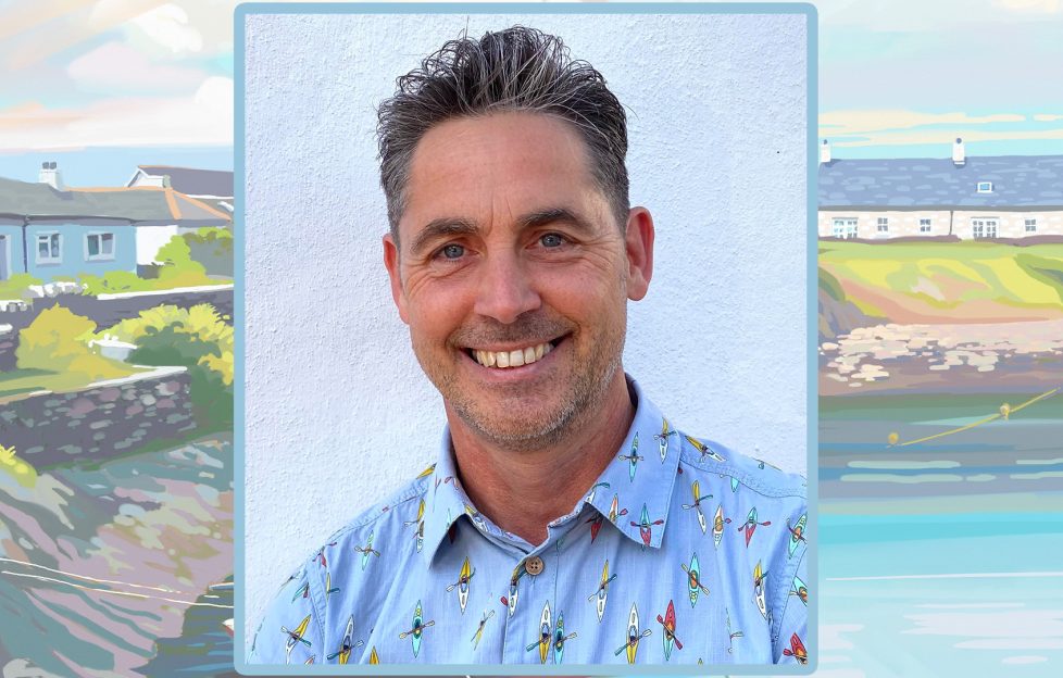
This week, Lucy chats to illustrator David Young about his work on our new-look covers.
Have you worked on “Friend” covers before?
I’ve worked for “The Peoples Friend” for nearly 30 years, illustrating short stories and serials, but had only painted a couple of covers in that time – Special issues, and a bookazine cover.
Illustrating covers, however, has been a very large part of my career for both books and magazines.
In this time, I’ve painted over 500 book jackets for novels, and was the cover artist for “The New Statesman” magazine for 10 years, portraying politicians in comical settings, but painted in a realistic style rather than the more common cartoon caricatures.
I’ve also painted the covers of “Scottish Memories” magazine, “Engineering and Technology” magazine and many more.
What were your initial thoughts about working on the new covers?
I was very excited about the new-style covers when Karen described it to me, and I set about researching the look and experimenting with painting techniques.
I produced a sample painting based on a photo I took of Polperro, a Cornish fishing village near where I live, and showed this to Karen and the team.
I was then commissioned to do the first new cover, which by chance was a painting of Looe which is also just down the road from me.
I’ve always loved the lovely old railway poster art from the 1930’s-60’s and this new style is based loosely on them but in a more modern feel, with flat vibrant colours and using digital art for it.
Can you run us through the process of working on a new cover?
I’ve been working on covers with commissioning illustrations editor, Karen.
Karen finds out what town or area is featured in the issue, and spends a lot of time finding just the right photo to use as a reference for the final artwork.
She will place this into a cover layout, perhaps just focusing in on a part of the photo and zooming in to make a good composition that works with the masthead and other type/pictures.
Once the team have seen and liked this, she sends me a brief and the reference photo along with her mock-up so I know which areas to leave undetailed, dark, light etc.
Up to this point, this is how the covers have been done for a long time. The change with the new covers to the old ones is that these are done on a computer whereas the old ones were traditional watercolours.
This doesn’t mean I just pop on my computer and get some app or Ai to create the painting though, far from it!
I am a traditional artist and paint on canvas with oil paints, so whilst here I paint digitally, I still use all my skills of applying, mixing and blending paint as I would sat at my easel but I’m able to do this using a graphics tablet pen and computer screen.
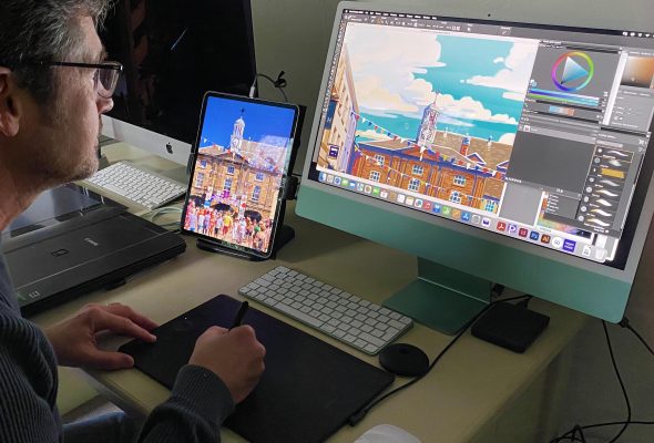
Pic: David Young
I use a program called Corel Painter and mainly use oil brushes.
I start off putting base colours on to the main areas like sea, land and sky and just like oil painting, I work from dark to light as I start to add detail.
When painting traditionally, I’ve always used a limited pallet of just four colours and white and everything is mixed from these.
I adopt the same technique of keeping a very limited number of colours for the covers that I can pick and blend.
This style is a lot flatter and with cleaner edges in order to get the desired look.
Each cover probably takes me about 2 days to do so is certainly not a quick two-minute process that people assume with digital art.
How would you describe the differences between working on covers, rather than fiction or serial artwork?
Well, they couldn’t be more different really, not only in content but the whole working process.
The fiction artwork used to be hand-painted and posted up to Dundee for scanning, but for many years nearly all of the PF artists have been painting digitally.
Creating the scene and composition often takes me far longer than the finished illustration.
Having read the story, I look for reference for the characters or I’ll often take my own photos if I can find people to match the character descriptions.
Research and finding costume reference and locations can also be very time consuming too but I really enjoy this part as well as conveying the atmosphere of the story.
Once it’s put together in photoshop as a mock-up and approved I’ll move it in to Corel painter, but this is a lighter painting process using the photographic mock-up as a base.
I like to give the final artwork an oil paint look but other artists go for more of a water colour look to theirs which helps to keep them all looking different.
These new covers by contrast are just painted from one reference photo but are totally painted from scratch and use no filters or overlays…every paint stroke is applied by hand.
