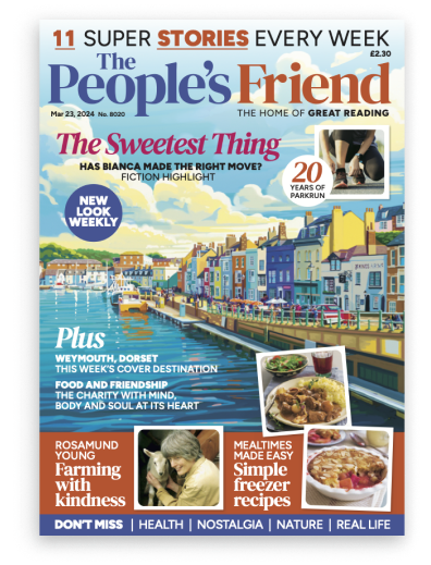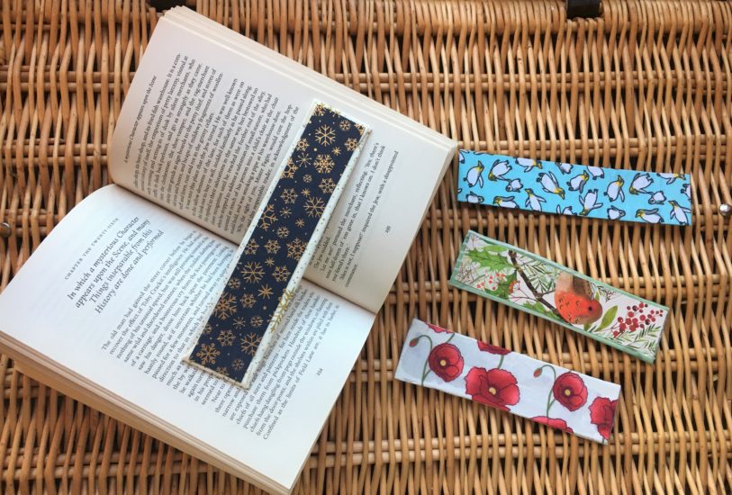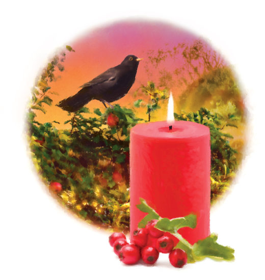
Thanks so much to everyone who sent a Christmas card in to the “Friend” office. We’ve had a lovely mix of cards this year; lots of traditional images like robins, snowy scenes, and Christmas trees; nativity scenes; and a beautiful hand-painted card, too.
As soon as you look at each image, you have an immediate sense of the ‘character’ of the card – fun, traditional, offbeat, or religious.
It’s the same with our illustrations here at the “Friend”. They’re so important, because they immediately set the tone for the story and engage the reader, drawing them in.
Like each of our stories, each illustration we use is unique, and like the Christmas cards, the image sets the tone.
How Do We Decide How To Illustrate Each Story?
Once a story has been purchased, we read through it again to carefully consider which illustration would best bring it to life. We liaise with Sarah, our Commissioning Art Editor, sending the story out to one of our illustrating team, or choosing an image from a picture library. Sometimes Sarah will work on this to give it more of a “Friend” feel.
It’s All About Balance
Once a week, Fiction Ed Shirley compiles the story mix – the assortment of stories that appears in each issue. She’s looking for a good mixture not only of stories and genres, but also of images – modern, as well as traditional. This makes sure every issue has the best ‘mix’ of stories and illustrations. And it’s important that the first story in each issue – the ‘opener’ – has a strong illustration to open the magazine with.
Complementing The Stories
“Friend” illustrations complement our fiction. 150 years ago, when our first issue was getting ready to go to press, the fiction was type-only, with no illustrations – making for a very type-y page!
